
 Feedback from the ones from the ones I posted yesterday showed that the last two didn't make the cut, the black was liked but w/o the pic of the block, and the top one was ok.
 So today I went back into Vistaprint today and worked up a few more possibilities without a picture of a quilt block on them.
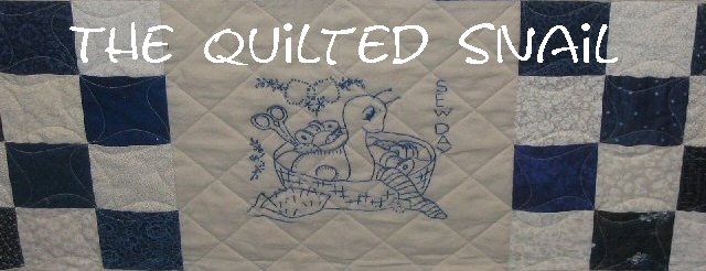
The top two pics to the right have been the clear winners so far.....I really like the colors of the second one but they are too dark for the writing to be clear in my opinion. I may make a $5 investment and have one of the graphic designers at Vistaprint lighten the colors up so that it is easier to see the printing.
I also like the top one, but it would definitely be my second choice.
 I still like the card on the bottom here from yesterday, but I like these two in the top pics better. So I'm getting closer to a decision and in order my business cards. =)
Gratitudes:
1. It's a long weekend for me....woohoo.
2. Good weather is predicted for tomorrow - a good thing since I'll be making a round trip to/from Austin all in one day.


3 comments:
I like the bottom one of the top two - it suggests creativity. The top one is classy but does not suggest creativity. lol
Either the second or the third one. I still like that one, and I don't like the first one at all. Too dull to be you! Different color ink? Maybe.
I agree with desertskyqults...#1 does not represent you at all!! You are colorful and creative and #1 doesn't say that!! Love the #2, all vibrant and creative like you! #3 today is a distant second to #2.
Post a Comment